Storyblok for Composable Content: Page Builder Power Without the Bloat
Use Storyblok’s visual editor and component model to ship fast: model content once, reuse everywhere, and keep marketers in flow.
Marketers want drag-and-drop. Developers want clean, reusable components. Storyblok offers both: a visual editor that operates on structured content.
Why teams choose Storyblok
Visual editing with real data. Marketers preview pages exactly as they’ll render.
Component-driven model. Your UI library (Hero, Cards, CTA) maps 1:1 to content blocks.
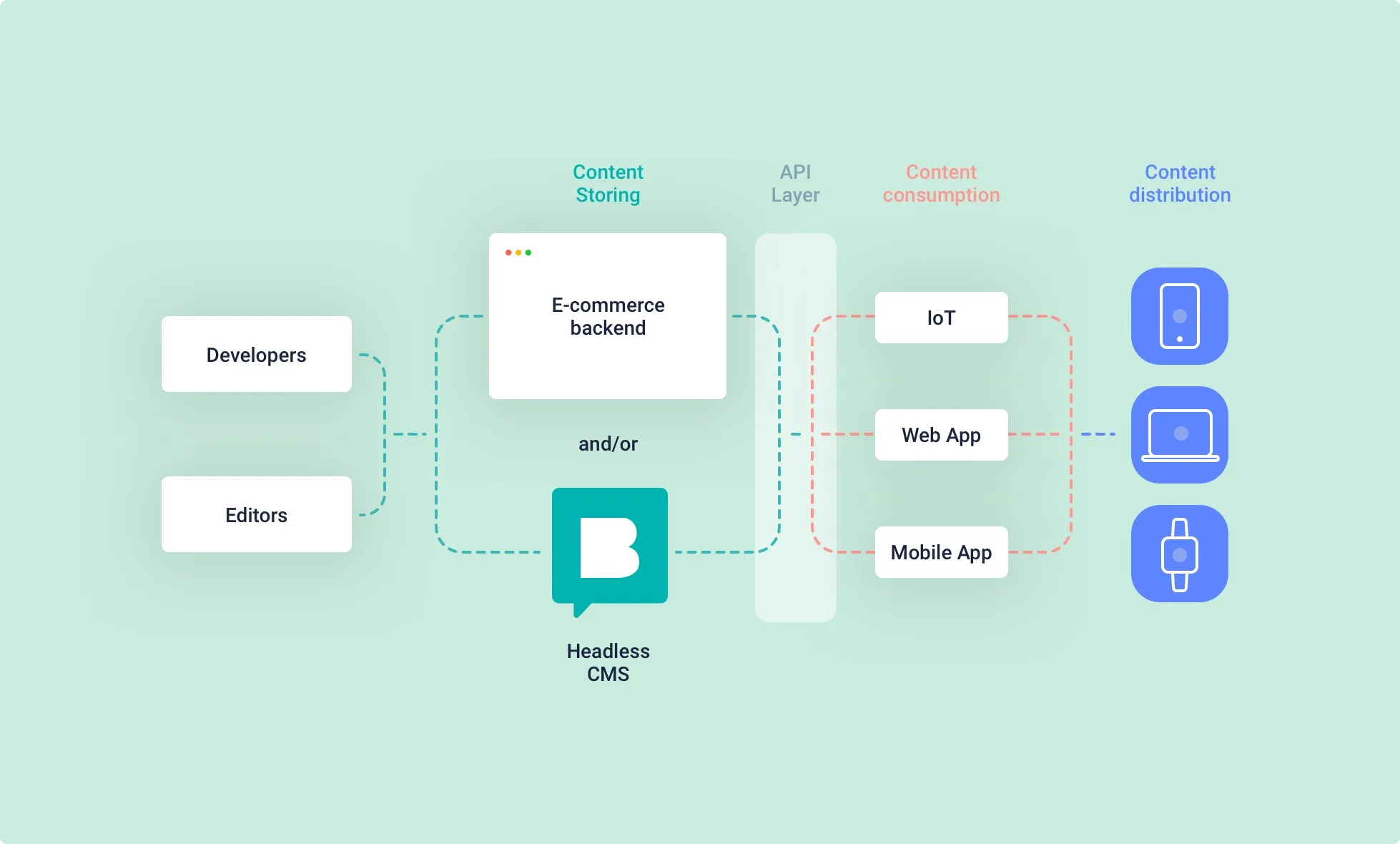
Multi-channel ready. Reuse the same content in the website, app, and email.
Workflows & roles. Draft → review → publish with audit trails.
Modeling playbook
Start from your design system. Each component becomes a Storyblok block with typed fields.
Guardrails, not handcuffs. Offer stylistic options (theme, alignment) but avoid free-form HTML.
Snippets for reuse. Common patterns (e.g., Pricing Tier) become snippets referenced across pages.
Global content. Header, Footer, Navigation, and Settings live in a singleton story.
SEO is first-class. Dedicated fields + templates for consistent Open Graph output.
Developer tips
Map block
componentto a React component in a DynamicComponent registry.Add TypeScript types for blok schemas to get prop safety.
Use
renderRichTextor a rich-text renderer to keep lists, headings, and embeds consistent.Cache Storyblok responses; revalidate on publish via webhooks.
Outcome: editors ship pages in hours, devs ship components once, and content stays consistent across channels.